The problem
This site has a narrower job than “personal website”: it exists to help me get hired as a software engineer or an ML/AI engineer, by showing my work instead of just claiming it in bullet points. It’s for recruiters and hiring managers first, though it’s also just my corner of the internet to put my thinking in public.
The previous version failed at that job. It was a Create React App project that looked like a marked-up resume: single page, anchor nav, percentage-filled skill bars with no meaning behind the numbers, project cards that opened modals instead of going anywhere. It showed that I could build things. It didn’t show how I think about building them.
So the constraint I gave myself for the rebuild: the medium should demonstrate the craft. A portfolio for a software engineer should be engineered thoughtfully, and every design decision should be something I’d be willing to defend.
Why Astro
CRA is effectively end-of-life, but more importantly it had no native path to a content-aware blog system, which was the whole point of the redesign. The blog isn’t decoration; it’s the connective tissue that makes the rest of the site meaningful.
Astro was the straightforward choice: content collections with frontmatter schemas, zero JS shipped by default, React as an opt-in island where interactivity is actually needed, and static output that deploys to Netlify with zero config. Next.js would have worked, but you fight it to go fully static. Building on Astro was genuinely straightforward from day one, which isn’t something I can say about every technical bet I’ve made.
How it’s built
Content layer. Everything content-driven lives in src/content/blog/ as Markdown or MDX. Posts have a data schema defining title, date, type, tags, stack, and an optional project field that links a post to an active build. Adding a new case study, build log entry, or essay is just writing a file — no database, no CMS, no manual curation of project cards or skill bars.
Blog feed. A single /blog route surfaces all posts, filterable by type and tag. The filter state lives in a React island (BlogFeed.jsx) so it’s client-side without shipping a full bundle. Everything else on the page is static HTML.
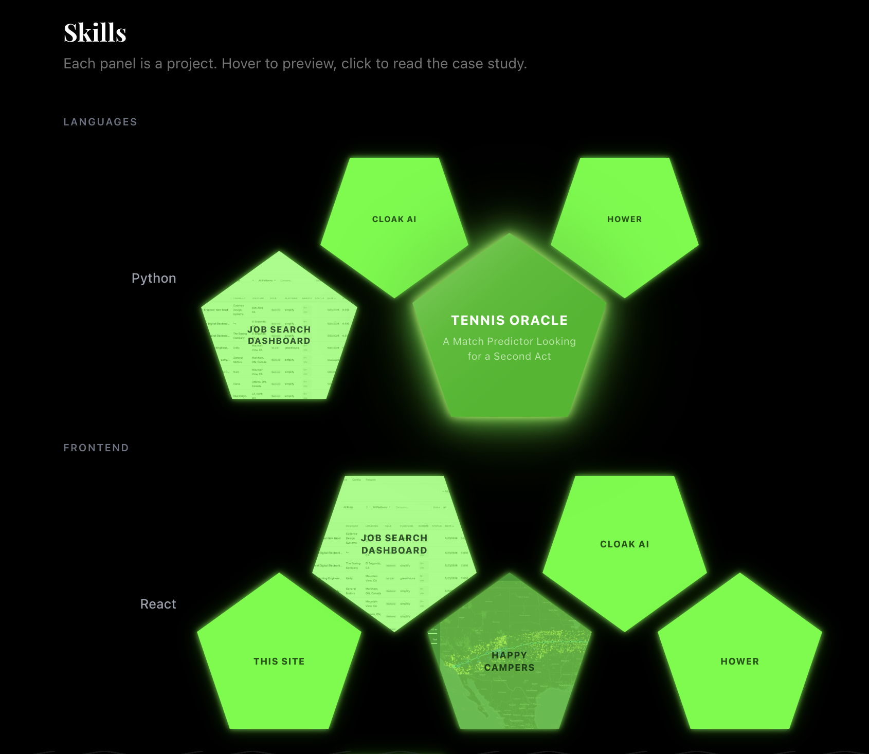
Pentagon zipper skill bars. Each skill row is filled with pentagonal panels — one per project that used that skill — driven by the stack frontmatter field. The categories are defined manually in src/data/skills.ts, but which projects appear is automatic: as more case studies get written, the bars fill themselves.
Active builds and build log. Projects currently in progress live in src/data/activeBuilds.ts; the home page pulls each project’s recent build log entries automatically via the project frontmatter field. When a project winds down, I write the case study and remove it from that list — it graduates to “Recent Work.” The build log itself is short-form, changelog-style entries, almost like public commit messages, and it’s the most honest record of how this site actually got made session by session.
Build log series and case-study links. Every build log carries that same project field; one function, getBuildLogSeries, fetches a project’s logs and its case study together, sorted by date, and every layout derives prev/next navigation, series position, and the case-study cross-link from that at build time — no hardcoded next/prev frontmatter to keep in sync when a post gets inserted or reordered. A case study gets a chronological list of its own build logs (the one below this section, for this project); a build log gets prev/next arrows plus a preview banner linking back here. The footer went through two passes — the first had a “Log N of M” counter and a link to the full unfiltered blog feed, and neither pulled its weight, so both got cut in favor of just the arrows and a bigger case-study banner. Full writeup in Build Log #006.
Working with Claude Code
I handed Claude Code the implementation wholesale. Early on we built a couple of context packs together to nail down scoping and design details before any code got written, which meant later sessions were mostly execution instead of negotiation. The content model, the aesthetic direction, and every word of every blog post are mine. What I handed off was the actual building: component structure, the CSS, wiring up the content collections, chasing down bugs like the Tailwind config error below. I directed and reviewed; I didn’t type most of it. I think that’s worth saying plainly rather than rounding up or down.
What broke
Tailwind’s config loader (jiti) can’t handle ESM await import(). The tailwind.config.mjs I wrote initially used a dynamic import for @tailwindcss/typography and silently produced an Unexpected identifier 'Promise' error at build time. The fix was renaming to tailwind.config.cjs and using require(). jiti handles CommonJS fine.
Outside of that, nothing here really fought me. The rough edge that’s still open is the mobile experience on pages other than the homepage. The landing page got its own dock treatment, but the rest of the site is still clearly formatted for desktop because I haven’t put mobile-considerate breakpoints on it yet. That, plus a newsletter signup so people have a reason to come back after a post drops, is what stands between this and a fully production-ready portfolio site.
What I didn’t expect to learn
The site is live (here) at pieteralley.dev, deployed on Netlify. If you’re reading this post, then the deployment was successful. But the thing I didn’t see coming is what made it work.
It’s easy to lose your own personality trying to fit a broad category like “software engineer portfolio.” The more I added my own photos, my own colors, my own fonts, my own opinions about layout, the more the site actually started to feel like me instead of like a template with my name swapped in.
I can yap, and I try to find useful ways to do it. This blog is where I put my thinking down in writing, in public, on purpose. I think that’s a real engineering skill, not a side hobby: being able to explain a solution clearly matters as much as being able to produce one. This site’s job is to show how I think, and the lesson was that showing how I think required actually putting myself in it.